Estimating univariate models
In the previous section, we introduced the applications of survival analysis and the mathematical objects on which it relies. In this article, we will work with real data and the lifelines library to estimate these objects.
Estimating the survival function using Kaplan-Meier
For this example, we will be investigating the lifetimes of political leaders around the world. A political leader, in this case, is defined by a single individual’s time in office who controls the ruling regime. This political leader could be an elected president, unelected dictator, monarch, etc. The birth event is the start of the individual’s tenure, and the death event is the voluntary retirement of the individual. Censoring can occur if they are a) still in offices at the time of dataset compilation (2008), or b) die while in power (this includes assassinations).
For example, the Bush regime began in 2000 and officially ended in 2008 upon his retirement, thus the regime’s lifespan was eight years, and there was a “death” event observed. On the other hand, the JFK regime lasted 2 years, from 1961 and 1963, and the regime’s official death event was not observed – JFK died before his official retirement.
(This is an example that has gladly redefined the birth and death events, and in fact completely flips the idea upside down by using deaths as the censoring event. This is also an example where the current time is not the only cause of censoring; there are the alternative events (e.g., death in office) that can be the cause of censoring.
To estimate the survival function, we first will use the Kaplan-Meier Estimate, defined:
where \(d_i\) are the number of death events at time \(t\) and \(n_i\) is the number of subjects at risk of death just prior to time \(t\).
Let’s bring in our dataset.
from lifelines.datasets import load_dd

data = load_dd()
data.head()
democracy |
regime |
start_year |
duration |
observed |
ctryname |
cowcode2 |
politycode |
un_region_name |
un_continent_name |
ehead |
leaderspellreg |
|---|---|---|---|---|---|---|---|---|---|---|---|
Non-democracy |
Monarchy |
1946 |
7 |
1 |
Afghanistan |
700 |
700 |
Southern Asia |
Asia |
Mohammad Zahir Shah |
Mohammad Zahir Shah.Afghanistan.1946.1952.Monarchy |
Non-democracy |
Civilian Dict |
1953 |
10 |
1 |
Afghanistan |
700 |
700 |
Southern Asia |
Asia |
Sardar Mohammad Daoud |
Sardar Mohammad Daoud.Afghanistan.1953.1962.Civilian Dict |
Non-democracy |
Monarchy |
1963 |
10 |
1 |
Afghanistan |
700 |
700 |
Southern Asia |
Asia |
Mohammad Zahir Shah |
Mohammad Zahir Shah.Afghanistan.1963.1972.Monarchy |
Non-democracy |
Civilian Dict |
1973 |
5 |
0 |
Afghanistan |
700 |
700 |
Southern Asia |
Asia |
Sardar Mohammad Daoud |
Sardar Mohammad Daoud.Afghanistan.1973.1977.Civilian Dict |
Non-democracy |
Civilian Dict |
1978 |
1 |
0 |
Afghanistan |
700 |
700 |
Southern Asia |
Asia |
Nur Mohammad Taraki |
Nur Mohammad Taraki.Afghanistan.1978.1978.Civilian Dict |
From the lifelines library, we’ll need the
KaplanMeierFitter for this exercise:
from lifelines import KaplanMeierFitter
kmf = KaplanMeierFitter()
Note
Other ways to estimate the survival function in lifelines are discussed below.
For this estimation, we need the duration each leader was/has been in office, and whether or not they were observed to have left office (leaders who died in office or were in office in 2008, the latest date this data was record at, do not have observed death events)
We next use the KaplanMeierFitter method fit() to fit the model to
the data. (This is similar to, and inspired by, scikit-learn’s fit/predict API).
Below we fit our data with the KaplanMeierFitter:
T = data["duration"]
E = data["observed"]

kmf.fit(T, event_observed=E)
After calling the fit() method, the KaplanMeierFitter has a property
called survival_function_ (again, we follow the styling of scikit-learn, and append an underscore to all properties that were estimated).
The property is a Pandas DataFrame, so we can call plot() on it:
from matplotlib import pyplot as plt


kmf.survival_function_.plot()
plt.title('Survival function of political regimes');
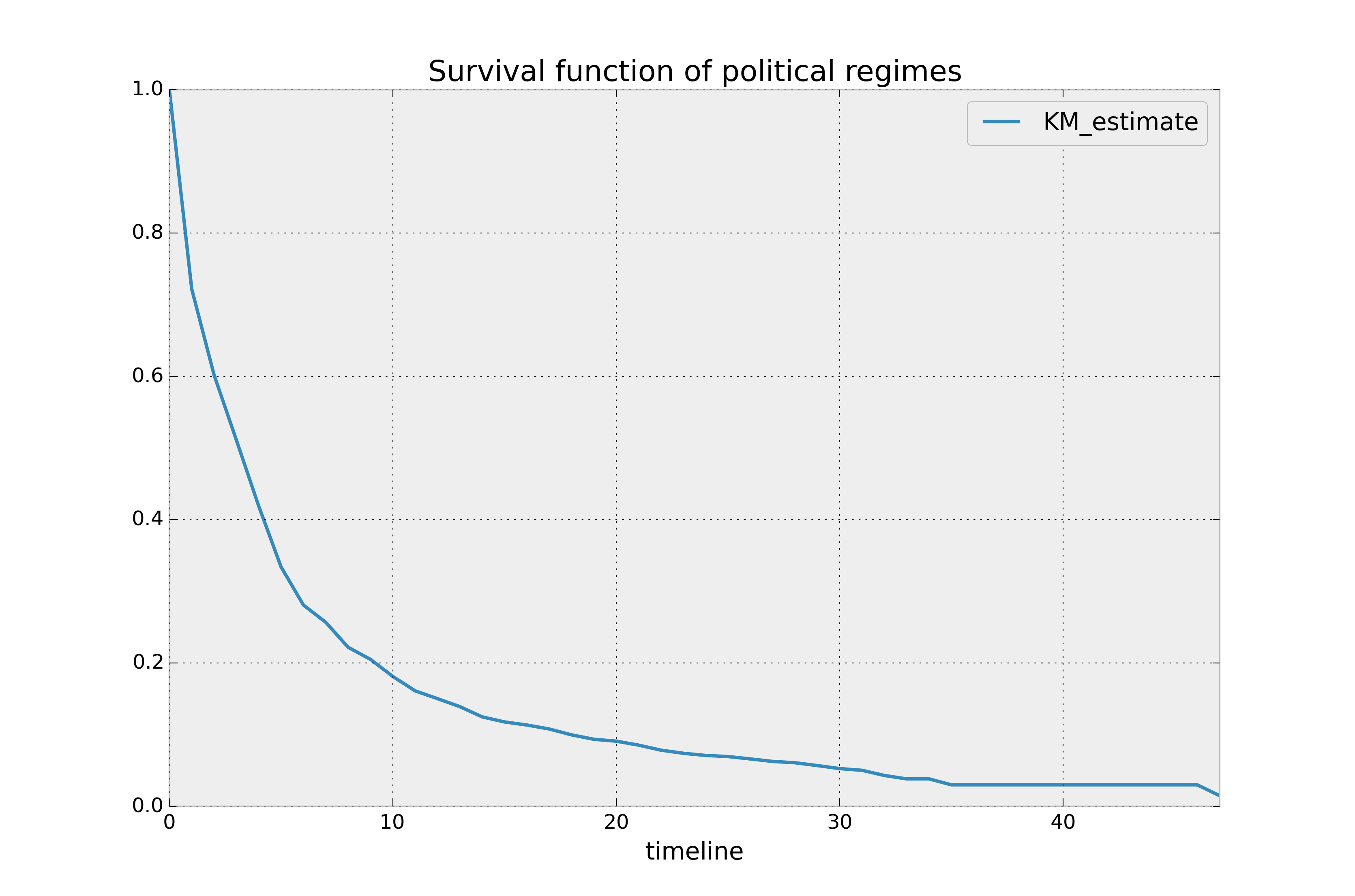
How do we interpret this? The y-axis represents the probability a leader is still
around after \(t\) years, where \(t\) years is on the x-axis. We
see that very few leaders make it past 20 years in office. Of course, we need to report how uncertain we are about these point estimates, i.e., we need confidence intervals. They are computed in
the call to fit(), and located under the confidence_interval_
property. (The method uses exponential Greenwood confidence interval. The mathematics are found in these notes.) We can call plot() on the KaplanMeierFitter itself to plot both the KM estimate and its confidence intervals:
kmf.plot_survival_function()
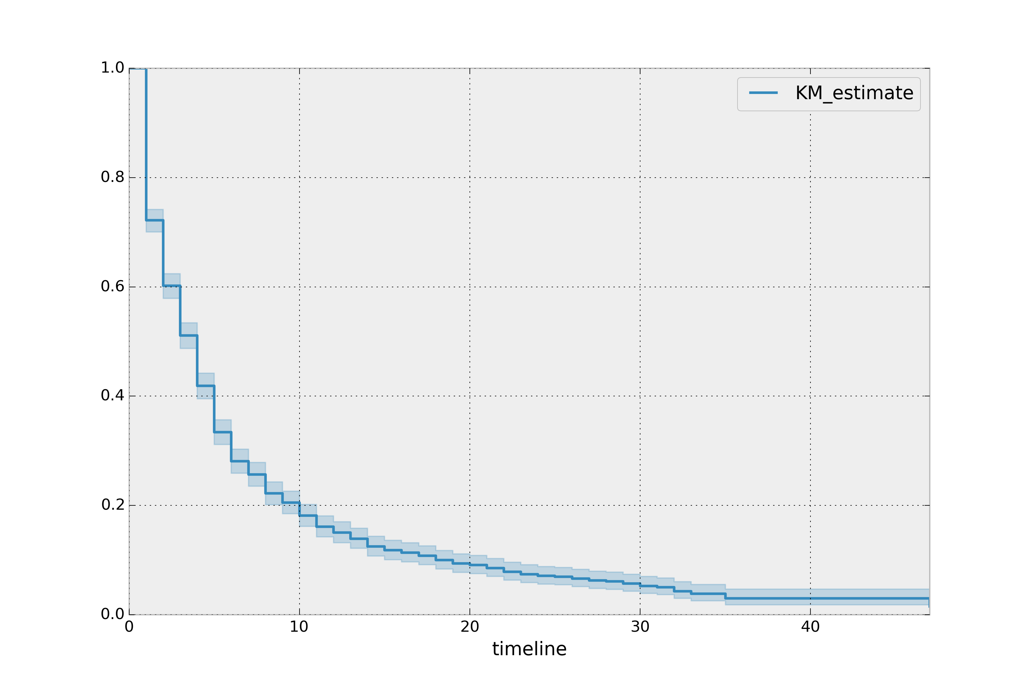
The median time in office, which defines the point in time where on average 50% of the population has expired, is a property:
kmf.median_survival_time_
#   4.0
Interesting that it is only four years. That means, around the world, elected leaders have a 50% chance of cessation in four years or less! To get the confidence interval of the median, you can use:
from lifelines.utils import median_survival_times
median_ci = median_survival_times(kmf.confidence_interval_)
Let’s segment on democratic regimes vs non-democratic regimes. Calling
plot on either the estimate itself or the fitter object will return
an axis object, that can be used for plotting further estimates:
ax = plt.subplot(111)

dem = (data["democracy"] == "Democracy")

kmf.fit(T[dem], event_observed=E[dem], label="Democratic Regimes")
kmf.plot_survival_function(ax=ax)

kmf.fit(T[~dem], event_observed=E[~dem], label="Non-democratic Regimes")
kmf.plot_survival_function(ax=ax)

plt.title("Lifespans of different global regimes");
We might be interested in estimating the probabilities in between some
points. We can do that with the timeline argument. We specify the
times we are interested in and are returned a DataFrame with the
probabilities of survival at those points:
import numpy as np

ax = plt.subplot(111)

t = np.linspace(0, 50, 51)
kmf.fit(T[dem], event_observed=E[dem], timeline=t, label="Democratic Regimes")
ax = kmf.plot_survival_function(ax=ax)

kmf.fit(T[~dem], event_observed=E[~dem], timeline=t, label="Non-democratic Regimes")
ax = kmf.plot_survival_function(ax=ax)

plt.title("Lifespans of different global regimes");
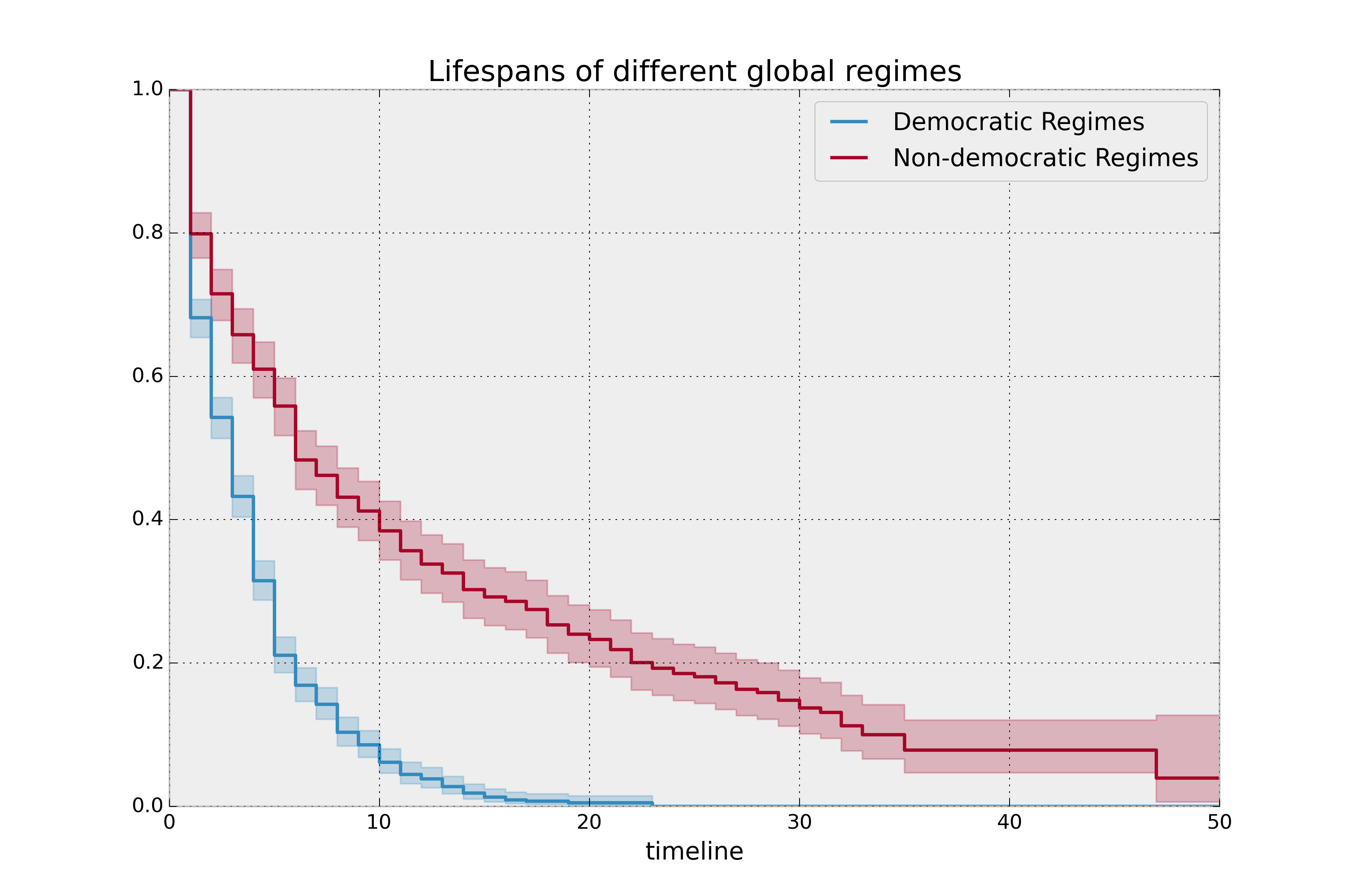
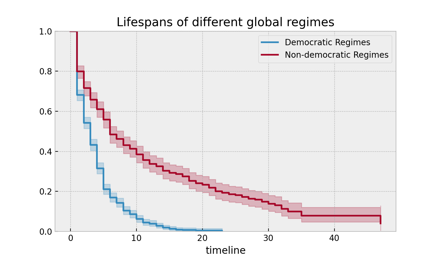
It is incredible how much longer these non-democratic regimes exist for. A democratic regime does have a natural bias towards death though: both via elections and natural limits (the US imposes a strict eight-year limit). The median of a non-democratic is only about twice as large as a democratic regime, but the difference is apparent in the tails: if you’re a non-democratic leader, and you’ve made it past the 10 year mark, you probably have a long life ahead. Meanwhile, a democratic leader rarely makes it past ten years, and then have a very short lifetime past that.
Here the difference between survival functions is very obvious, and
performing a statistical test seems pedantic. If the curves are more
similar, or we possess less data, we may be interested in performing a
statistical test. In this case, lifelines contains routines in
lifelines.statistics to compare two survival functions. Below we
demonstrate this routine. The function lifelines.statistics.logrank_test() is a common
statistical test in survival analysis that compares two event series’
generators. If the value returned exceeds some pre-specified value, then
we rule that the series have different generators.
from lifelines.statistics import logrank_test

results = logrank_test(T[dem], T[~dem], E[dem], E[~dem], alpha=.99)

results.print_summary()

"""
<lifelines.StatisticalResult>
             t_0 = -1
null_distribution = chi squared
degrees_of_freedom = 1
           alpha = 0.99

---
test_statistic      p  -log2(p)
       260.47  <0.005    192.23
"""
There are alternative (and sometimes better) tests of survival functions, and we explain more here: Statistically compare two populations
Lets compare the different types of regimes present in the dataset:
regime_types = data['regime'].unique()

for i, regime_type in enumerate(regime_types):
    ax = plt.subplot(2, 3, i + 1)

    ix = data['regime'] == regime_type
    kmf.fit(T[ix], E[ix], label=regime_type)
    kmf.plot_survival_function(ax=ax, legend=False)

    plt.title(regime_type)
    plt.xlim(0, 50)

    if i==0:
        plt.ylabel('Frac. in power after $n$ years')

plt.tight_layout()

Best practices for presenting Kaplan Meier plots
A recent survey of statisticians, medical professionals, and other stakeholders suggested that the addition of two pieces of information, summary tables and confidence intervals, greatly increased the effectiveness of Kaplan Meier plots, see “Morris TP, Jarvis CI, Cragg W, et al. Proposals on Kaplan–Meier plots in medical research and a survey of stakeholder views: KMunicate. BMJ Open 2019;9:e030215. doi:10.1136/bmjopen-2019-030215”.
In lifelines, confidence intervals are automatically added, but there is the at_risk_counts kwarg to add summary tables as well:
kmf = KaplanMeierFitter().fit(T, E, label="all_regimes")
kmf.plot_survival_function(at_risk_counts=True)
plt.tight_layout()
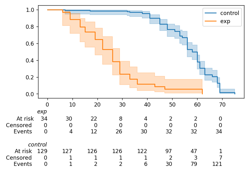
For more details, and how to extend this to multiple curves, see docs here.
Getting data into the right format
lifelines data format is consistent across all estimator class and
functions: an array of individual durations, and the individuals
event observation (if any). These are often denoted T and E
respectively. For example:
T = [0, 3, 3, 2, 1, 2]
E = [1, 1, 0, 0, 1, 1]
kmf.fit(T, event_observed=E)
The raw data is not always available in this format – lifelines
includes some helper functions to transform data formats to lifelines
format. These are located in the lifelines.utils sub-library. For
example, the function datetimes_to_durations() accepts an array or
Pandas object of start times/dates, and an array or Pandas objects of
end times/dates (or None if not observed):
from lifelines.utils import datetimes_to_durations

start_date = ['2013-10-10 0:00:00', '2013-10-09', '2013-10-10']
end_date = ['2013-10-13', '2013-10-10', None]
T, E = datetimes_to_durations(start_date, end_date, fill_date='2013-10-15')
print('T (durations): ', T)
print('E (event_observed): ', E)
T (durations):  [ 3.  1.  5.]
E (event_observed):  [ True  True False]
The function datetimes_to_durations() is very flexible, and has many
keywords to tinker with.
Estimating hazard rates using Nelson-Aalen
The survival functions is a great way to summarize and visualize the survival dataset, however it is not the only way. If we are curious about the hazard function \(h(t)\) of a population, we unfortunately cannot transform the Kaplan Meier estimate – statistics doesn’t work quite that well. Fortunately, there is a proper non-parametric estimator of the cumulative hazard function, \(H(t)\):
The estimator for this quantity is called the Nelson Aalen estimator:
where \(d_i\) is the number of deaths at time \(t_i\) and \(n_i\) is the number of susceptible individuals.
In lifelines, this estimator is available as the NelsonAalenFitter. Let’s use the regime dataset from above:
T = data["duration"]
E = data["observed"]

from lifelines import NelsonAalenFitter
naf = NelsonAalenFitter()

naf.fit(T,event_observed=E)
After fitting, the class exposes the property cumulative_hazard_`() as
a DataFrame:
print(naf.cumulative_hazard_.head())
naf.plot_cumulative_hazard()
   NA-estimate
0     0.000000
1     0.325912
2     0.507356
3     0.671251
4     0.869867

[5 rows x 1 columns]
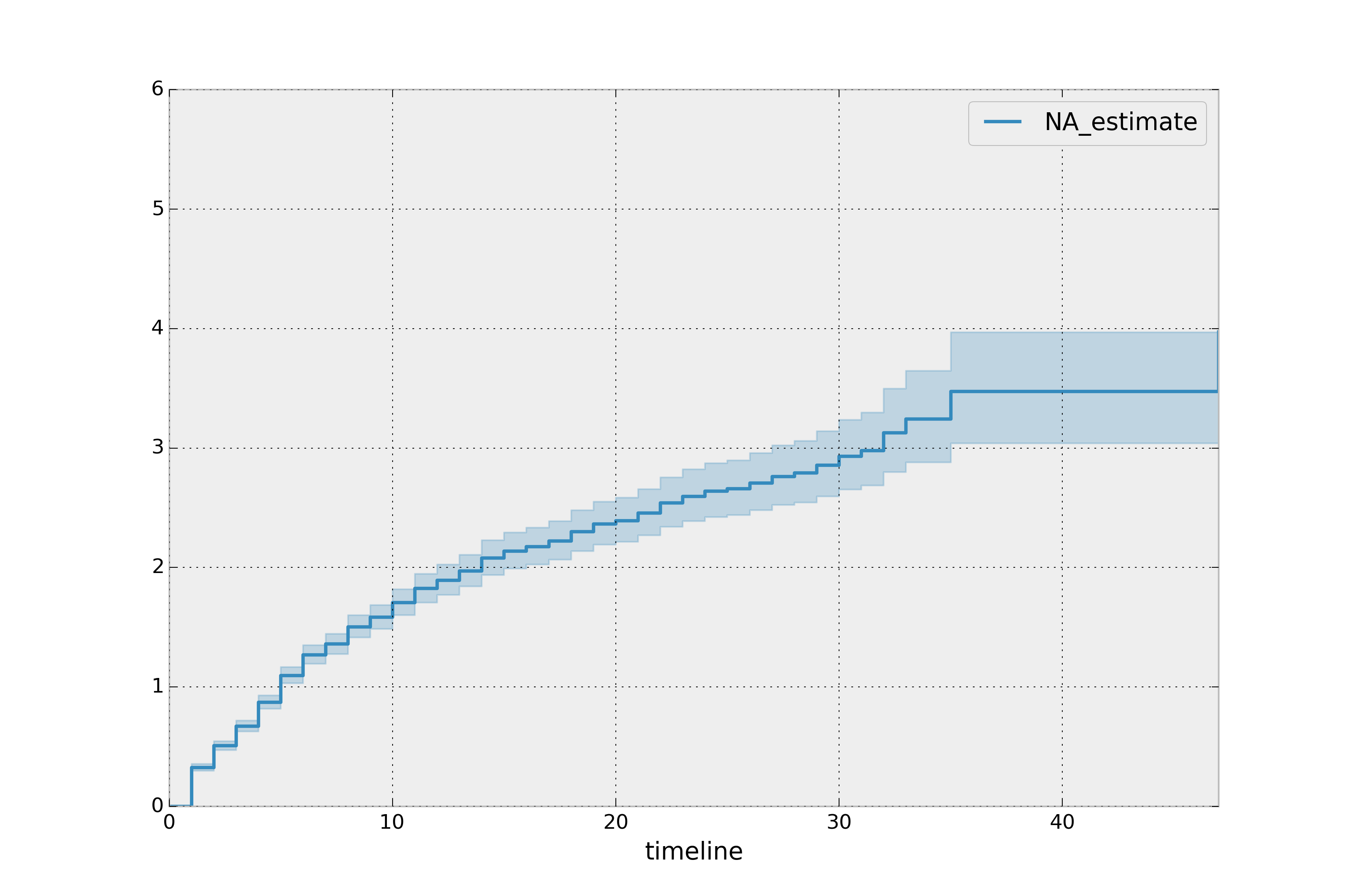
The cumulative hazard has less obvious understanding than the survival functions, but the hazard functions is the basis of more advanced techniques in survival analysis. Recall that we are estimating cumulative hazard functions, \(H(t)\). (Why? The sum of estimates is much more stable than the point-wise estimates.) Thus we know the rate of change of this curve is an estimate of the hazard function.
Looking at figure above, it looks like the hazard starts off high and gets smaller (as seen by the decreasing rate of change). Let’s break the regimes down between democratic and non-democratic, during the first 20 years:
Note
We are using the loc argument in the call to plot_cumulative_hazard here: it accepts a slice and plots only points within that slice.
naf.fit(T[dem], event_observed=E[dem], label="Democratic Regimes")
ax = naf.plot_cumulative_hazard(loc=slice(0, 20))

naf.fit(T[~dem], event_observed=E[~dem], label="Non-democratic Regimes")
naf.plot_cumulative_hazard(ax=ax, loc=slice(0, 20))

plt.title("Cumulative hazard function of different global regimes");
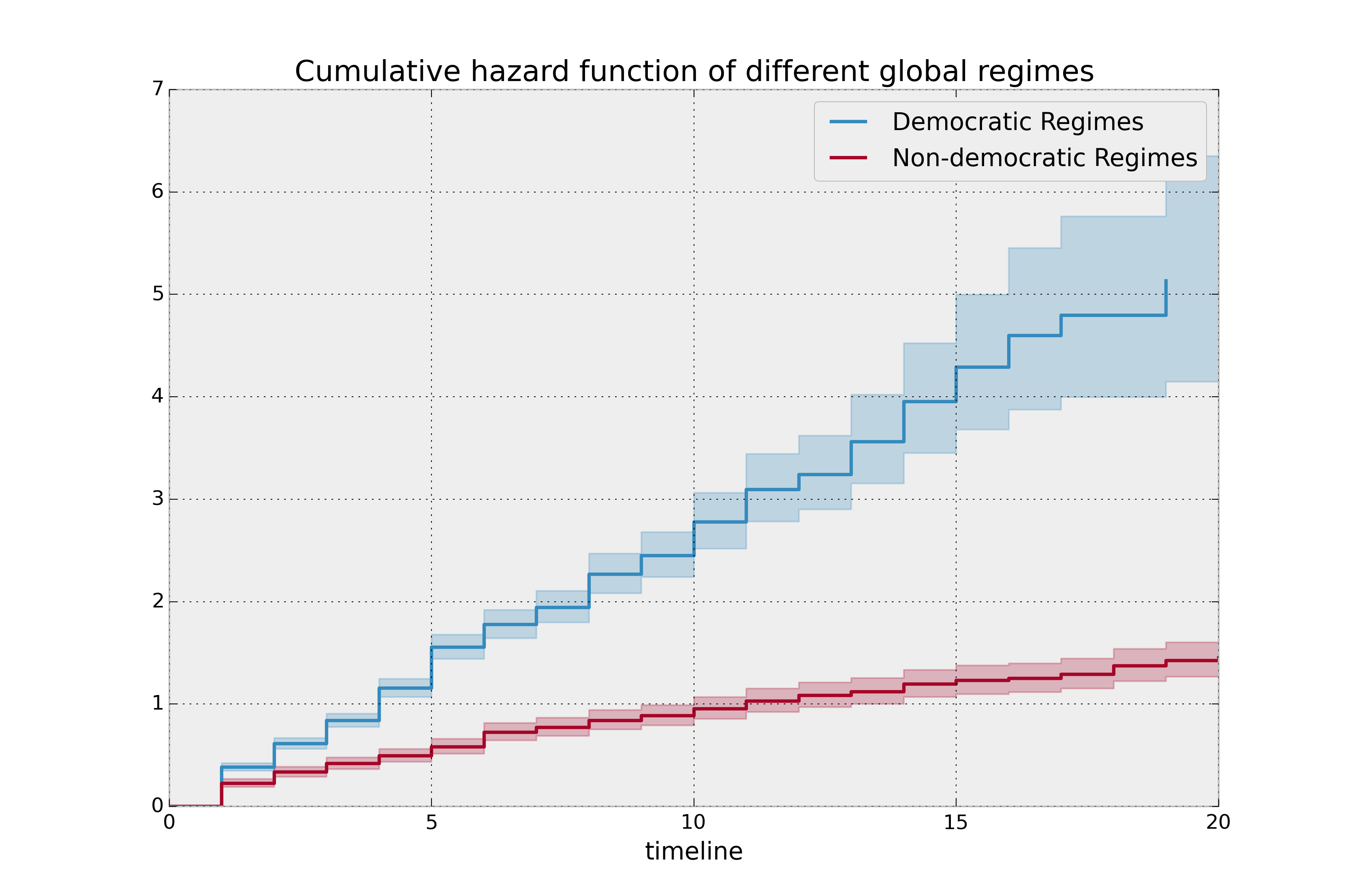
Looking at the rates of change, I would say that both political philosophies have a constant hazard, albeit democratic regimes have a much higher constant hazard.
Smoothing the hazard function
Interpretation of the cumulative hazard function can be difficult – it is not how we usually interpret functions. On the other hand, most survival analysis is done using the cumulative hazard function, so understanding it is recommended.
Alternatively, we can derive the more interpretable hazard function, but
there is a catch. The derivation involves a kernel smoother (to smooth
out the differences of the cumulative hazard function) , and this requires
us to specify a bandwidth parameter that controls the amount of
smoothing. This functionality is in the smoothed_hazard_()
and smoothed_hazard_confidence_intervals_() methods. Why methods?
They require an argument representing the bandwidth.
There is also a plot_hazard() function (that also requires a
bandwidth keyword) that will plot the estimate plus the confidence
intervals, similar to the traditional plot() functionality.
bandwidth = 3.

naf.fit(T[dem], event_observed=E[dem], label="Democratic Regimes")
ax = naf.plot_hazard(bandwidth=bandwidth)

naf.fit(T[~dem], event_observed=E[~dem], label="Non-democratic Regimes")
naf.plot_hazard(ax=ax, bandwidth=bandwidth)

plt.title("Hazard function of different global regimes | bandwidth=%.1f" % bandwidth);
plt.ylim(0, 0.4)
plt.xlim(0, 25);
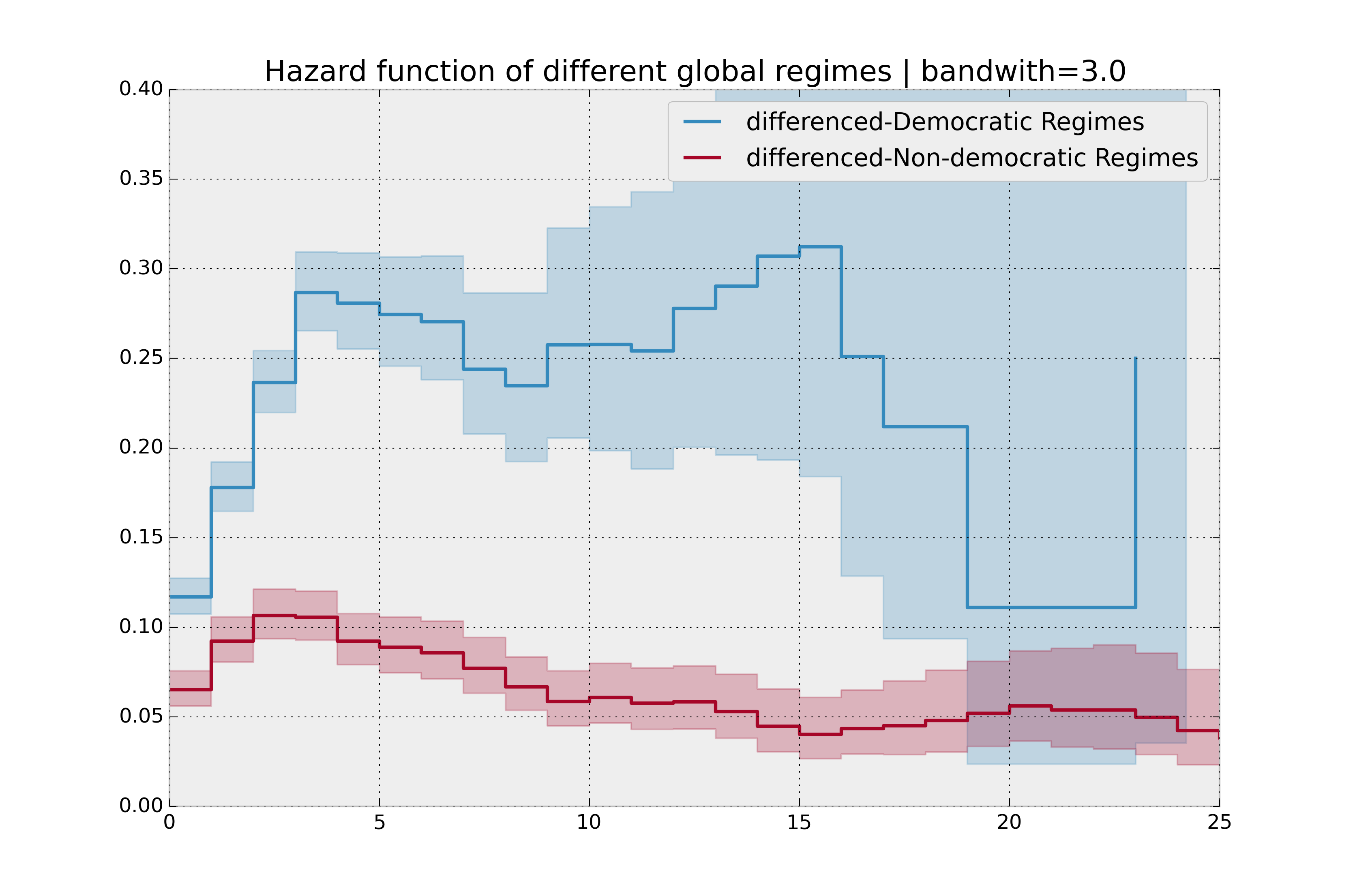
It is more clear here which group has the higher hazard, and Non-democratic regimes appear to have a constant hazard.
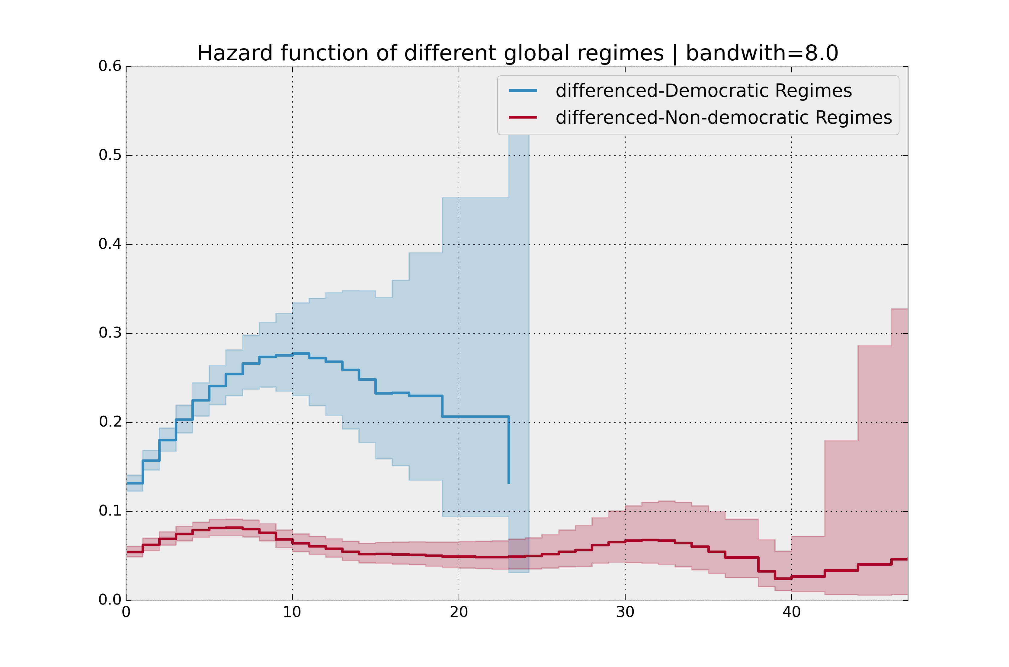
There is no obvious way to choose a bandwidth, and different bandwidths produce different inferences, so it’s best to be very careful here. My advice: stick with the cumulative hazard function.
bandwidth = 8.0

naf.fit(T[dem], event_observed=E[dem], label="Democratic Regimes")
ax = naf.plot_hazard(bandwidth=bandwidth)

naf.fit(T[~dem], event_observed=E[~dem], label="Non-democratic Regimes")
naf.plot_hazard(ax=ax, bandwidth=bandwidth)

plt.title("Hazard function of different global regimes | bandwidth=%.1f" % bandwidth);
Estimating cumulative hazards using parametric models
Fitting to a Weibull model
Another very popular model for survival data is the Weibull model. In contrast the the Nelson-Aalen estimator, this model is a parametric model, meaning it has a functional form with parameters that we are fitting the data to. (The Nelson-Aalen estimator has no parameters to fit to). The survival function looks like:
A priori, we do not know what \(\lambda\) and \(\rho\) are, but we use the data on hand to estimate these parameters. We model and estimate the cumulative hazard rate instead of the survival function (this is different than the Kaplan-Meier estimator):
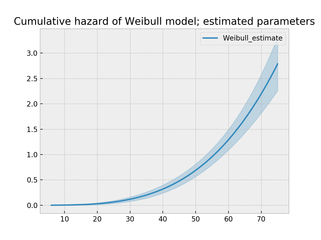
In lifelines, estimation is available using the WeibullFitter class. The plot() method will plot the cumulative hazard.
from lifelines import WeibullFitter
from lifelines.datasets import load_waltons

data = load_waltons()

T = data['T']
E = data['E']

wf = WeibullFitter().fit(T, E)

wf.print_summary()
ax = wf.plot_cumulative_hazard()
ax.set_title("Cumulative hazard of Weibull model; estimated parameters")


"""
<lifelines.WeibullFitter: fitted with 163 observations, 7 censored>
number of subjects = 163
  number of events = 156
    log-likelihood = -672.062
        hypothesis = lambda != 1, rho != 1

---
         coef  se(coef)  lower 0.95  upper 0.95      p  -log2(p)
lambda_  0.02      0.00        0.02        0.02 <0.005       inf
rho_     3.45      0.24        2.97        3.93 <0.005     76.83
"""
Other parametric models: Exponential, Log-Logistic, Log-Normal and Splines
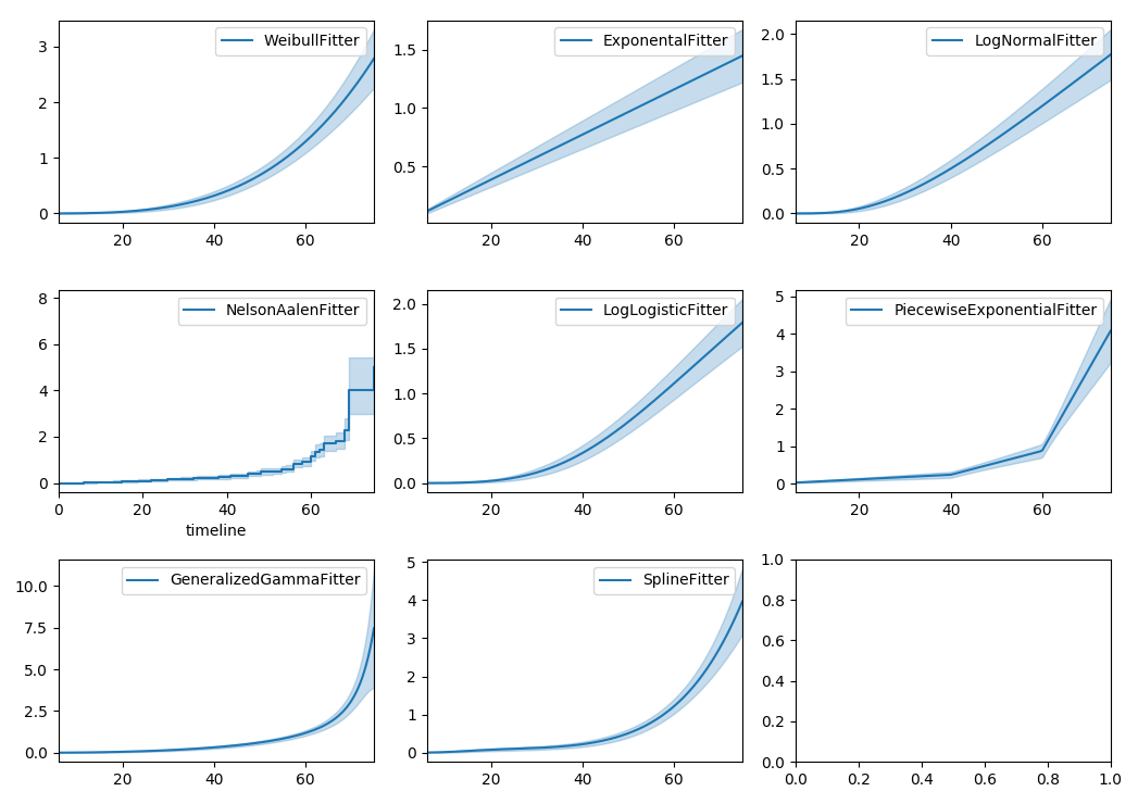
Similarly, there are other parametric models in lifelines. Generally, which parametric model to choose is determined by either knowledge of the distribution of durations, or some sort of model goodness-of-fit. Below are the built-in parametric models, and the Nelson-Aalen non-parametric model, of the same data.
from lifelines import (WeibullFitter, ExponentialFitter,
LogNormalFitter, LogLogisticFitter, NelsonAalenFitter,
PiecewiseExponentialFitter, GeneralizedGammaFitter, SplineFitter)

from lifelines.datasets import load_waltons
data = load_waltons()

fig, axes = plt.subplots(3, 3, figsize=(10, 7.5))

T = data['T']
E = data['E']

wbf = WeibullFitter().fit(T, E, label='WeibullFitter')
exf = ExponentialFitter().fit(T, E, label='ExponentialFitter')
lnf = LogNormalFitter().fit(T, E, label='LogNormalFitter')
naf = NelsonAalenFitter().fit(T, E, label='NelsonAalenFitter')
llf = LogLogisticFitter().fit(T, E, label='LogLogisticFitter')
pwf = PiecewiseExponentialFitter([40, 60]).fit(T, E, label='PiecewiseExponentialFitter')
gg = GeneralizedGammaFitter().fit(T, E, label='GeneralizedGammaFitter')
spf = SplineFitter([6, 20, 40, 75]).fit(T, E, label='SplineFitter')

wbf.plot_cumulative_hazard(ax=axes[0][0])
exf.plot_cumulative_hazard(ax=axes[0][1])
lnf.plot_cumulative_hazard(ax=axes[0][2])
naf.plot_cumulative_hazard(ax=axes[1][0])
llf.plot_cumulative_hazard(ax=axes[1][1])
pwf.plot_cumulative_hazard(ax=axes[1][2])
gg.plot_cumulative_hazard(ax=axes[2][0])
spf.plot_cumulative_hazard(ax=axes[2][1])
lifelines can also be used to define your own parametric model. There is a tutorial on this available, see Piecewise Exponential Models and Creating Custom Models.
Parametric models can also be used to create and plot the survival function, too. Below we compare the parametric models versus the non-parametric Kaplan-Meier estimate:
from lifelines import KaplanMeierFitter

fig, axes = plt.subplots(3, 3, figsize=(10, 7.5))

T = data['T']
E = data['E']

kmf = KaplanMeierFitter().fit(T, E, label='KaplanMeierFitter')
wbf = WeibullFitter().fit(T, E, label='WeibullFitter')
exf = ExponentialFitter().fit(T, E, label='ExponentialFitter')
lnf = LogNormalFitter().fit(T, E, label='LogNormalFitter')
llf = LogLogisticFitter().fit(T, E, label='LogLogisticFitter')
pwf = PiecewiseExponentialFitter([40, 60]).fit(T, E, label='PiecewiseExponentialFitter')
gg = GeneralizedGammaFitter().fit(T, E, label='GeneralizedGammaFitter')
spf = SplineFitter([6, 20, 40, 75]).fit(T, E, label='SplineFitter')

wbf.plot_survival_function(ax=axes[0][0])
exf.plot_survival_function(ax=axes[0][1])
lnf.plot_survival_function(ax=axes[0][2])
kmf.plot_survival_function(ax=axes[1][0])
llf.plot_survival_function(ax=axes[1][1])
pwf.plot_survival_function(ax=axes[1][2])
gg.plot_survival_function(ax=axes[2][0])
spf.plot_survival_function(ax=axes[2][1])
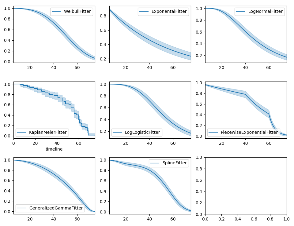
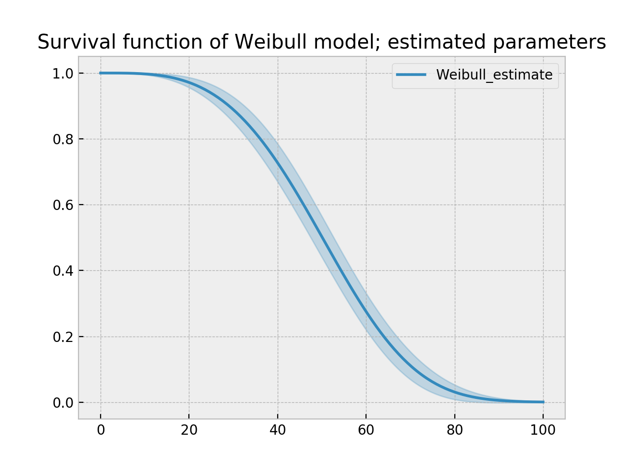
With parametric models, we have a functional form that allows us to extend the survival function (or hazard or cumulative hazard) past our maximum observed duration. This is called extrapolation. We can do this in a few ways.
timeline = np.linspace(0, 100, 200)

# directly compute the survival function, these return a pandas Series
wbf = WeibullFitter().fit(T, E)
wbf.survival_function_at_times(timeline)
wbf.hazard_at_times(timeline)
wbf.cumulative_hazard_at_times(timeline)

# use the `timeline` kwarg in `fit`
# by default, all functions and properties will use
# these values provided
wbf = WeibullFitter().fit(T, E, timeline=timeline)

ax = wbf.plot_survival_function()
ax.set_title("Survival function of Weibull model; estimated parameters")
Model Selection
When the underlying data generation distribution is unknown, we resort to measures of fit to tell us which model is most appropriate. lifelines has provided qq-plots, Selecting a parametric model using QQ plots, and also tools to compare AIC and other measures: Selecting a parametric model using AIC.
Other types of censoring
Left censored data and non-detection
We’ve mainly been focusing on right-censoring, which describes cases where we do not observe the death event. This situation is the most common one. Alternatively, there are situations where we do not observe the birth event occurring. Consider the case where a doctor sees a delayed onset of symptoms of an underlying disease. The doctor is unsure when the disease was contracted (birth), but knows it was before the discovery.
Another situation where we have left-censored data is when measurements have only an upper bound, that is, the measurements instruments could only detect the measurement was less than some upper bound. This bound is often called the limit of detection (LOD). In practice, there could be more than one LOD. One very important statistical lesson: don’t “fill-in” this value naively. It’s tempting to use something like one-half the LOD, but this will cause lots of bias in downstream analysis. An example dataset is below:
Note
The recommended API for modeling left-censored data using parametric models changed in version 0.21.0. Below is the recommended API.
from lifelines.datasets import load_nh4
df = load_nh4()[['NH4.Orig.mg.per.L', 'NH4.mg.per.L', 'Censored']]
print(df.head())

"""
  NH4.Orig.mg.per.L  NH4.mg.per.L  Censored
1            <0.006         0.006      True
2            <0.006         0.006      True
3             0.006         0.006     False
4             0.016         0.016     False
5            <0.006         0.006      True
"""
lifelines has support for left-censored datasets in most univariate models, including the KaplanMeierFitter class, by using the fit_left_censoring() method.
T, E = df['NH4.mg.per.L'], ~df['Censored']

kmf = KaplanMeierFitter()
kmf.fit_left_censoring(T, E)
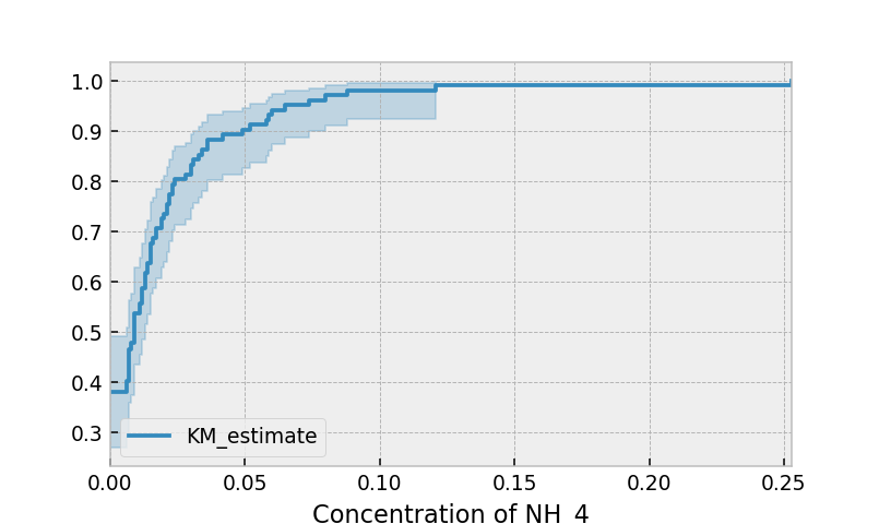
Instead of producing a survival function, left-censored data analysis is more interested in the cumulative density function. This is available as the cumulative_density_ property after fitting the data.
print(kmf.cumulative_density_.head())

kmf.plot_cumulative_density() #will plot the CDF
plt.xlabel("Concentration of NH_4")

"""
          KM_estimate
timeline
0.000        0.379897
0.006        0.401002
0.007        0.464319
0.008        0.478828
0.009        0.536868
"""
Alternatively, you can use a parametric model to model the data. This allows for you to “peer” below the LOD, however using a parametric model means you need to correctly specify the distribution. You can use plots like qq-plots to help invalidate some distributions, see Selecting a parametric model using QQ plots and Selecting a parametric model using AIC.
from lifelines import *
from lifelines.plotting import qq_plot

fig, axes = plt.subplots(3, 2, figsize=(9, 9))
timeline = np.linspace(0, 0.25, 100)

wf = WeibullFitter().fit_left_censoring(T, E, label="Weibull", timeline=timeline)
lnf = LogNormalFitter().fit_left_censoring(T, E, label="Log Normal", timeline=timeline)
lgf = LogLogisticFitter().fit_left_censoring(T, E, label="Log Logistic", timeline=timeline)

# plot what we just fit, along with the KMF estimate
kmf.plot_cumulative_density(ax=axes[0][0], ci_show=False)
wf.plot_cumulative_density(ax=axes[0][0], ci_show=False)
qq_plot(wf, ax=axes[0][1])

kmf.plot_cumulative_density(ax=axes[1][0], ci_show=False)
lnf.plot_cumulative_density(ax=axes[1][0], ci_show=False)
qq_plot(lnf, ax=axes[1][1])

kmf.plot_cumulative_density(ax=axes[2][0], ci_show=False)
lgf.plot_cumulative_density(ax=axes[2][0], ci_show=False)
qq_plot(lgf, ax=axes[2][1])
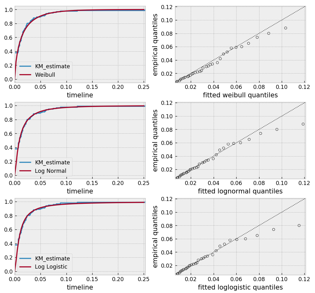
Based on the above, the log-normal distribution seems to fit well, and the Weibull not very well at all.
Interval censored data
Data can also be interval censored. An example of this is periodically recording a population of organisms. Their deaths are interval censored because you know a subject died between two observations periods.
from lifelines.datasets import load_diabetes
from lifelines.plotting import plot_interval_censored_lifetimes

df = load_diabetes()
plot_interval_censored_lifetimes(df['left'], df['right'])
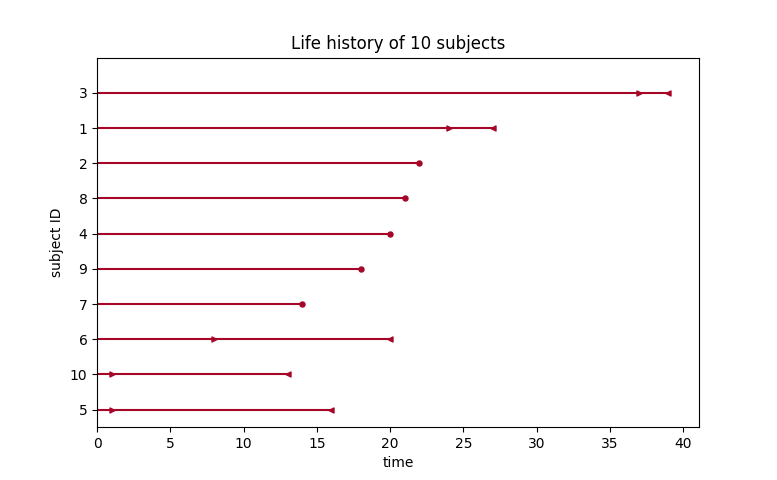
Above, we can see that some subjects’ death was exactly observed (denoted by a red ●), and some subjects’ deaths is bounded between two times (denoted by the interval between the red ▶︎ ◀︎). We can perform inference on the data using any of our models. Note the use of calling fit_interval_censoring instead of fit.
Note
The API for fit_interval_censoring is different than right and left censored data.
wf = WeibullFitter()
wf.fit_interval_censoring(lower_bound=df['left'], upper_bound=df['right'])

# or, a non-parametric estimator:
# for now, this assumes closed observation intervals, ex: [4,5], not (4, 5) or (4, 5]
kmf = KaplanMeierFitter()
kmf.fit_interval_censoring(df['left'], df['right'])

ax = kmf.plot_survival_function()
wf.plot_survival_function(ax=ax)
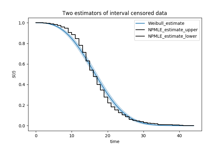
Another example of using lifelines for interval censored data is located here.
Left truncated (late entry) data
Another form of bias that is introduced into a dataset is called left-truncation (or late entry). Left-truncation can occur in many situations. One situation is when individuals may have the opportunity to die before entering into the study. For example, if you are measuring time to death of prisoners in prison, the prisoners will enter the study at different ages. So it’s possible there are some counter-factual individuals who would have entered into your study (that is, went to prison), but instead died early.
All fitters, like KaplanMeierFitter and any parametric models, have an optional argument for entry, which is an array of equal size to the duration array. It describes the time between actual “birth” (or “exposure”) to entering the study.
Note
Nothing changes in the duration array: it still measures time from “birth” to time exited study (either by death or censoring). That is, durations refers to the absolute death time rather than a duration relative to the study entry.
Another situation with left-truncation occurs when subjects are exposed before entry into study. For example, a study of time to all-cause mortality of AIDS patients that recruited individuals previously diagnosed with AIDS, possibly years before. In our example below we will use a dataset like this, called the Multicenter Aids Cohort Study. In the figure below, we plot the lifetimes of subjects. A solid line is when the subject was under our observation, and a dashed line represents the unobserved period between diagnosis and study entry. A solid dot at the end of the line represents death.
from lifelines.datasets import load_multicenter_aids_cohort_study
from lifelines.plotting import plot_lifetimes

df = load_multicenter_aids_cohort_study()

plot_lifetimes(
    df["T"],
    event_observed=df["D"],
    entry=df["W"],
    event_observed_color="#383838",
    event_censored_color="#383838",
    left_truncated=True,
)
plt.ylabel("Patient Number")
plt.xlabel("Years from AIDS diagnosis")
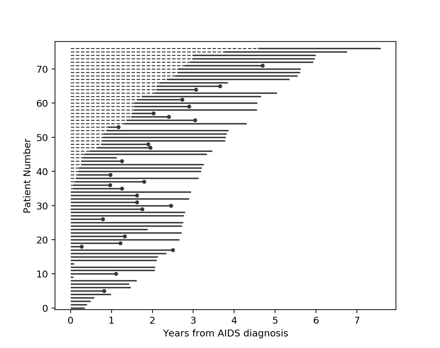
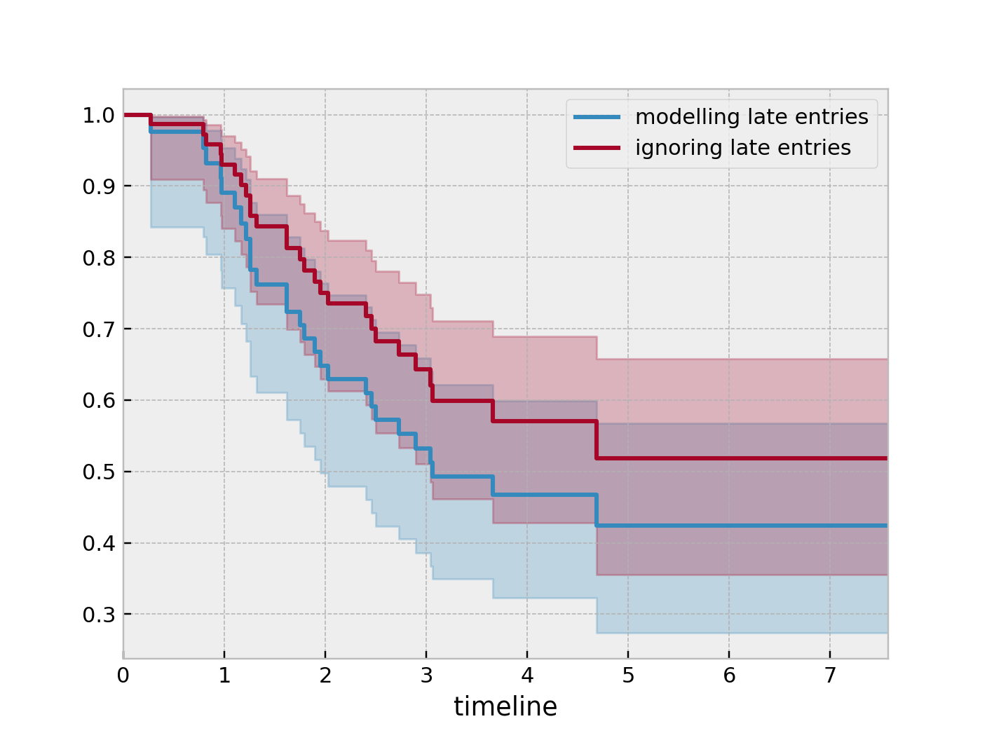
So subject #77, the subject at the top, was diagnosed with AIDS 7.5 years ago, but wasn’t in our study for the first 4.5 years. From this point-of-view, why can’t we “fill in” the dashed lines and say, for example, “subject #77 lived for 7.5 years”? If we did this, we would severely underestimate chance of dying early on after diagnosis. Why? It’s possible that there were individuals who were diagnosed and then died shortly after, and never had a chance to enter our study. If we did manage to observe them however, they would have depressed the survival function early on. Thus, “filling in” the dashed lines makes us over confident about what occurs in the early period after diagnosis. We can see this below when we model the survival function with and without taking into account late entries.
from lifelines import KaplanMeierFitter

kmf = KaplanMeierFitter()
kmf.fit(df["T"], event_observed=df["D"], entry=df["W"], label='modeling late entries')
ax = kmf.plot_survival_function()

kmf.fit(df["T"], event_observed=df["D"], label='ignoring late entries')
kmf.plot_survival_function(ax=ax)
